
Visual Design

Brief: a logo and identity that could represent India and contemporary conversations around India at a prestigious global platform, while upholding the legacy of the conference which is at its 22nd edition.
We wanted the logo to embody two facets – ‘India’, as a specific context, and ‘conference’, as a platform of global discussion. The translation, however, was not that straightforward.
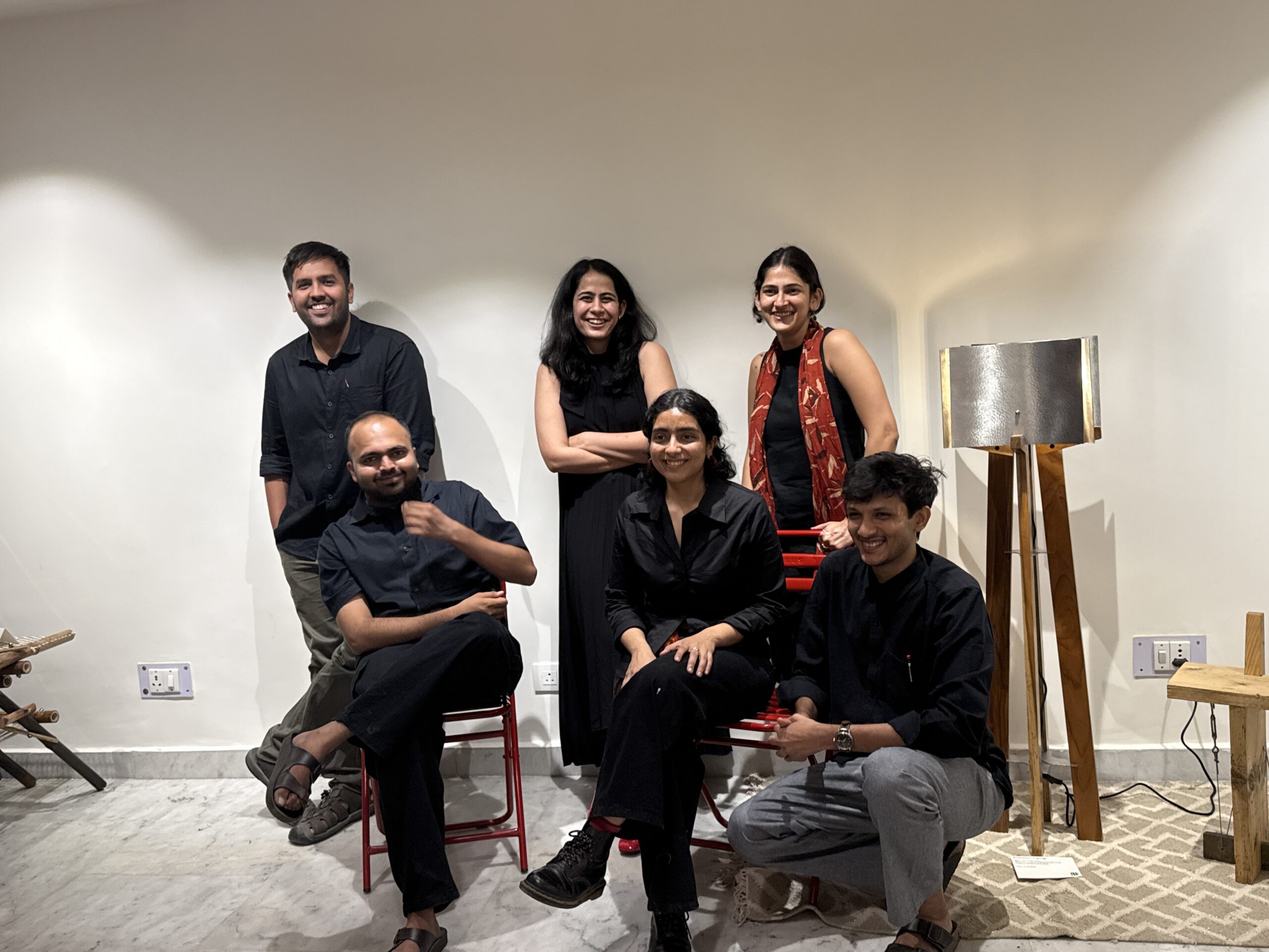
As a team of 6 people from different parts of the country ranging from Jammu to Chennai, India meant different things to us. The logo had to please the diverse perspectives on representing our country within the team, before even making rounds of client feedback. Additionally, as we borrowed from cultural nuances, we had to be careful not to let our representation become romantic symbolism.

It was only instinctive to draw and dump all our thoughts on what we thought could speak India onto our sketchbooks and artboards. Our rigorous process resulted in a library of borrowed and reinterpreted patterns, symbols, photographs, and icons from a multitude of times, histories, and sentiments encompassing India. Working with this library helped us eventually amalgamate 3 symbolic features into a logo for the conference.
First, a Banyan tree representative of the traditions of discussion that often take place under the shade of trees. Across various geographies in India, trees tend to become centres of knowledge exchange, facilitators of chance encounters, and host institutions of education and administration. Second, pillars symbolising institutional support and vision, within which the conference takes shape every year. Third, a platform where every distinct idea comes together, thoughts intermingle, and new imaginaries are crafted. Stylistically, the logo draws inspiration from various printing and weaving traditions of India.

As we were building the overall identity, we decided to challenge the chromo-phobic colonial traditions of monochromatic graphic styles. We went all out with colours! Our home-curated photographic library of vibrant textiles from across the country helped us choose these colours thoughtfully.


We were fascinated by stamps. We nerded on how over years, Indian stamps have captured important events, social and political movements, technological revolutions, cultural practices, etc in small rectangular graphics with such ingenuity. As the project made us amateur philatelists, we were sure that stamps would become a central part of the graphic language. The theme of the conference: ‘From India to the World: Business, Policy, and Culture’ resonated perfectly with the idea, as stamps are the economic tools which have helped ship knowledge from India to the World in the form of letters, cargoes, postcards, etc, for ages.What the graphics (and the stamps) would contain, was a rather fun journey. All of us at blurck like to travel, and we like clicking photographs even more. We dug deep into our shared albums of places we had travelled to, across the country (between the six of us, we’ve got quite a bit of the map covered). These pictures were then collaged and edited to form a library of imagery which would background important information and announcements for the conference.

As we reach the finish line, and put together all our graphics into files for merchandise, social media templates, printables, etc., reflecting on the process brings a smile. This project has been a long journey and much of it is still in pipelines. We look forward to seeing it manifest in the physical space of the conference at Harvard University.
The visual identity speaks to us of the plurality of culture in India found in the everyday mundane as well as the extraordinary. It furnishes a befitting stage for the conference that encapsulates the multiplicity of knowledge and innovation ecosystems found and flourishing – ‘from India to the world’.